Why are these contango/backwardation graphs different?

The more I read into this on the internet, the more I got confused

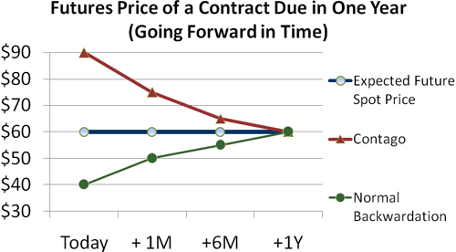
I understand that Contango is basically where futures price is above the expected spot price, and backwardation is the opposite.

However, can someone explain why the two graphs for contango are shaped opposite?

http://i.investopedia.com/inv/articles/site/CT-Contango2.gif (contango shaping down)

http://www.cboeoptionshub.com/wp-content/uploads/lithium/1412_vix-contango-curve.jpg (contango shaping up)

I think that they’re showing different things.

The second graph appears to be showing the prices for forward contracts expiring at various times in the future; the x-axis is how many days from today until the contract expires.

The first graph appears to be showing the prices for forward contracts starting at different times in the future and all expiring at the same time (one year from today); the x-axis is how many days from today until the start of the contract.